
( A )
I led the design organization at Veelzy, branching the product design group with design research, as well as establishing an in-house brand and design team. This unification of the different design practices is unique, and was a draw for both myself and many of the designers who joined the company over the course of the year. Startup companies at Veelzy’s scale have a unique opportunity to have brand, content and product inform each other, rather than be separated by the walls of org division that plague larger institutions.
( B )
While at Veelzy, I scaled the design team from 2 to 5, with designers located across the globe. Most of the work shown below is executed by that talented group. These examples are a smattering of some of the work that shipped during my tenure, and I’ll continue to add more here as more of the work comes to fruition.
( C )
Head of Design, 2024 - 2025
building a design system
When I joined Veelzy, the team had already redesigned the app four times in pursuit of product-market fit. Each iteration had been built from scratch — every layout, every interaction, every component created anew. It was clear this approach wasn’t sustainable. New features, no matter how similar to existing ones, required fresh design and code each time. There was no shared language, no reusable foundation — just a cycle of starting over.
It wasn’t just a design problem — it was taking a real toll on development velocity. I opened up the conversation across design, engineering, and product, and we quickly aligned on a shared goal: to build a design system that would allow us to scale with consistency, efficiency, and intent. As a bonus, the system would bring the design direction into sharper focus, introducing constraints where chaos had previously lived.
Over the course of a month, I designed the foundational structure of the system: tokens, elements, and 48 core components that would act as the building blocks of the app. We left room for flexibility — some components were defined as outlines or placeholders for native implementations, ensuring the system didn’t get in the way of platform-specific nuance.
The philosophy behind the system was clear: it should be modular, universal, and adaptable enough to support other products in the future. Color palettes were defined in themes, inverse and brand. Typography styles were abstracted into variables. The system was built to evolve, not just serve the needs of the present.
At its heart, the design system became a product of its own — a tool for building tools. Components like Text, Icon, and Button formed the base layer, while more complex patterns — Search, Selector, Input — were assembled on top. This composable structure made it easy to scale without reinventing the wheel.
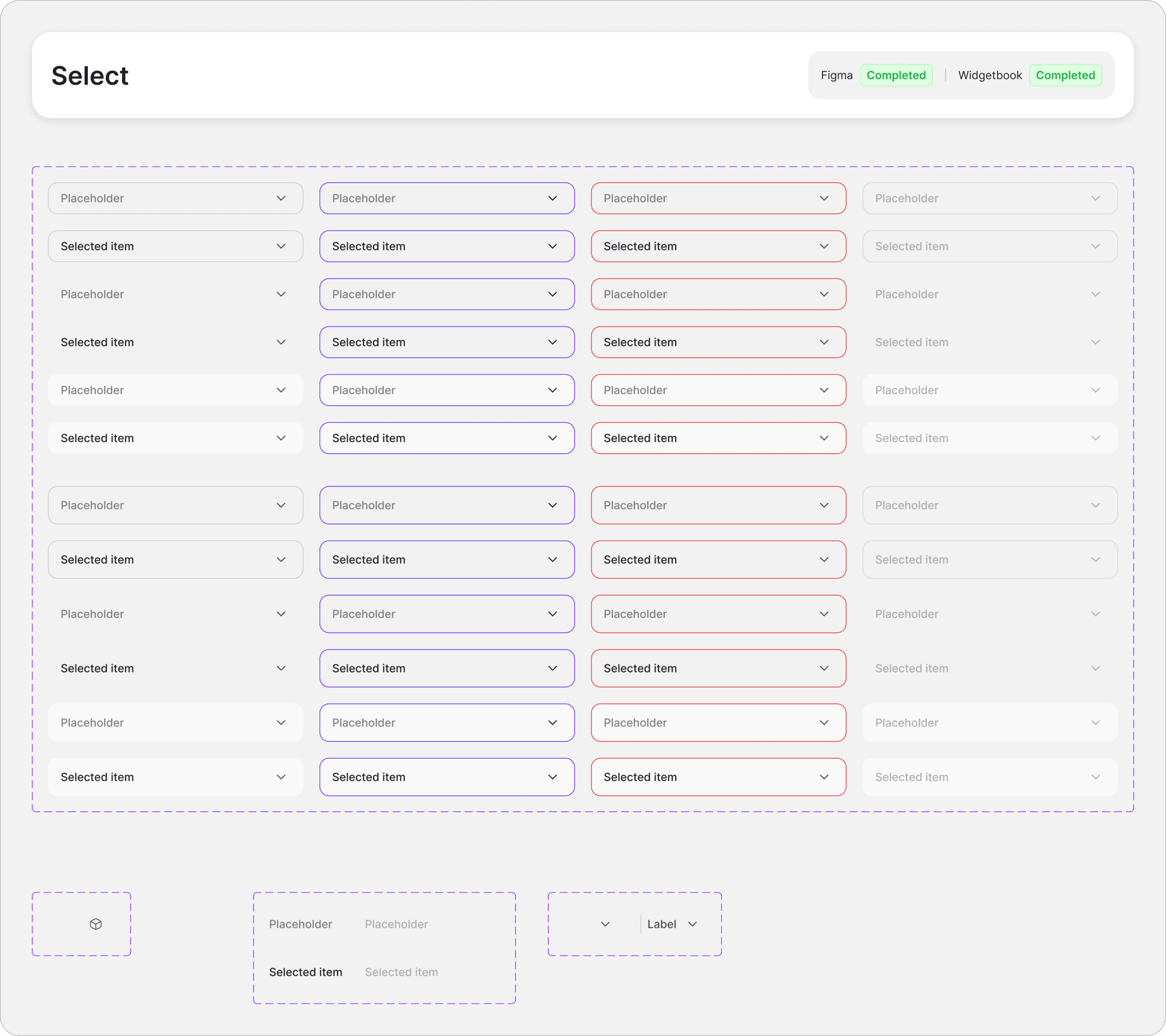
[fig 1]
Select component with variants and structure for swap instances in leading and trailing parts
From a process standpoint, we didn’t pause feature development to build the system. Instead, we used it actively — designing new features with the new components, then progressively migrating legacy screens as the system matured. It took about two months of parallel implementation to reach full adoption, but it paid off quickly: development sped up by 40%, inconsistencies vanished, and the product gained a sense of cohesion it hadn’t had before.
Once the components were fully implemented, we turned our attention to documentation. Together with our system analyst and developers, we created an internal wiki to house the design system. Since we were working in Flutter and Storybook didn’t support it, we opted for Widgetbook — its closest analog for Flutter. We documented all patterns, usage rules, and component examples there. This resource quickly became essential for onboarding engineers and boosting adoption across the team, ensuring the system wouldn’t just live in Figma but thrive in production.
Design systems are one of those things I could talk about endlessly. But what mattered here wasn’t the system itself — it was what it unlocked: a more confident, aligned team and a product finally able to grow without breaking itself apart.
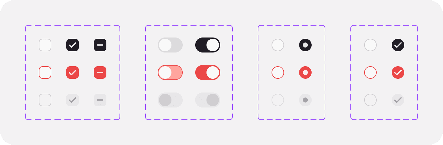
[fig 2]
Different types of toggles
drawing icons
One of the initiatives I led at Veelzy was aligning the product’s visual language with the evolving brand. As we began shaping the design system, I brought on a brand designer to help build out the identity beyond marketing assets — someone who could embed the brand’s voice directly into the product itself.
One of her first major contributions was a massive iconography effort. In just under a month, she created a custom library of 650 icons — each drawn in both outline and solid styles to support different use cases. These weren’t just assets; they became an essential thread that tied the brand and product together. The icons were expressive, cohesive, and uniquely ours — helping the design system feel less like a collection of components and more like a unified language.
That work elevated the visual tone of the app and brought the brand to life across every surface — buttons, menus, inputs and more. It was one of those subtle but powerful shifts that made the entire product feel more intentional, more polished, and unmistakably Veelzy.
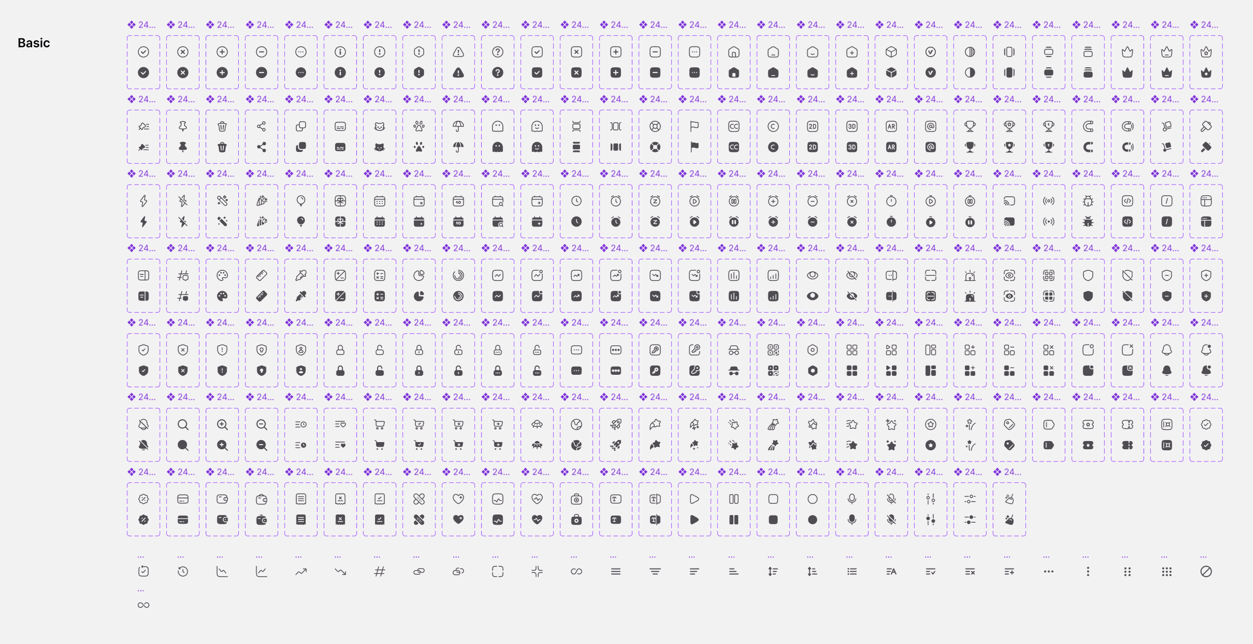
[fig 3]
One of 13 different themes of icons done by Madina Bugdaeva
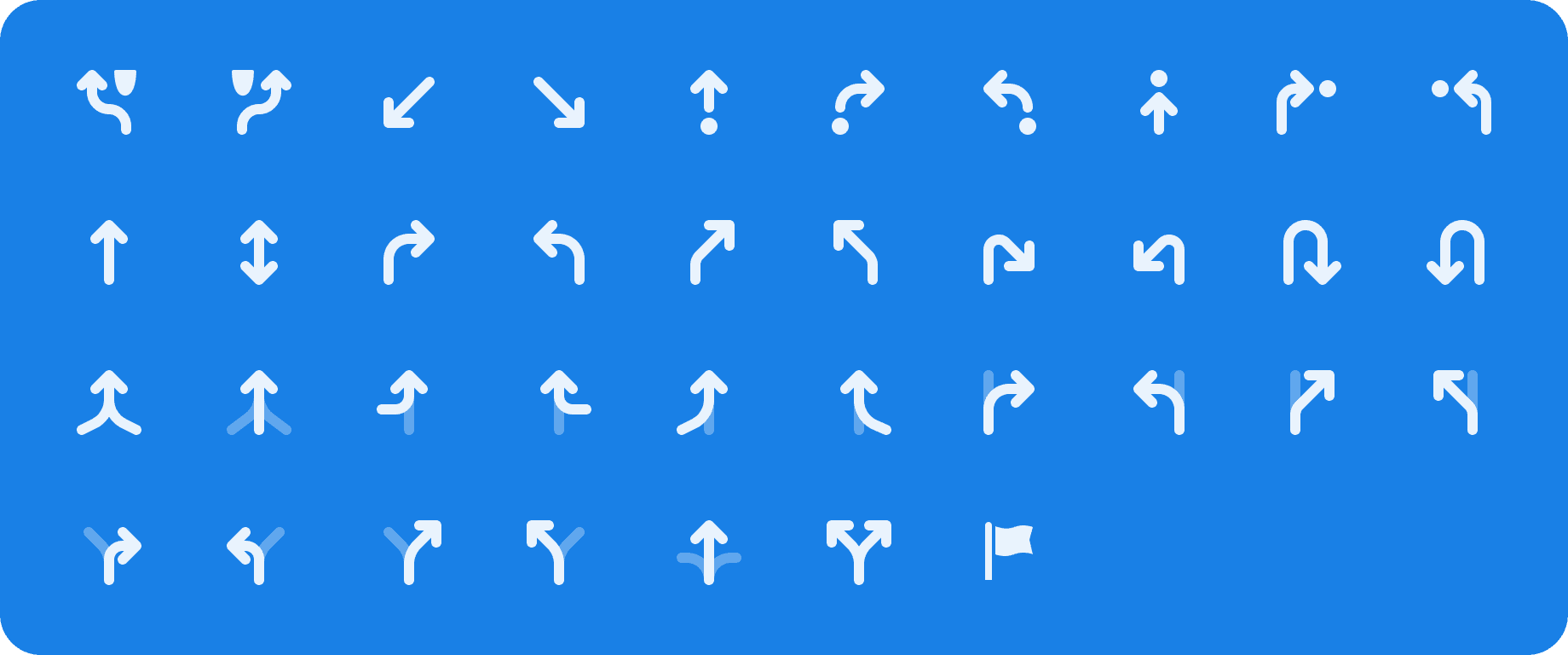
Alongside the broader iconography effort, I also contributed a more utilitarian set of icons focused on navigation. These were purpose-built for the core biking experience — icons for routes, turns, detours, and direction changes.
While they didn’t carry the expressive weight of brand elements, they played a critical role in clarity and usability. In a product built around movement and orientation, these subtle visual cues helped bikers stay on course, even at a glance. It was a quiet kind of design work — functional, minimal, and absolutely essential.
[fig 4]
building group rides: mvp and bigger vision
Group Rides was one of the first big features we tackled at Veelzy — a way to help users ride together and make the experience more social. The idea was simple: start solo, then invite others to join mid-setup.
As we designed the flow, real-world edge cases surfaced — approvals, invites, location drift, and user readiness — quickly adding complexity. We also explored live rider tracking on the map but postponed it due to technical overhead.
To move fast, we scoped an MVP: users could create a ride with start and end points, set a time, and share an invite link. Since Veelzy’s navigation was still on legacy components, we kept Group Rides separate to avoid breaking the core flow.
It was a lean launch, but intentional — allowing us to validate the feature and build toward a more seamless multiplayer experience later.
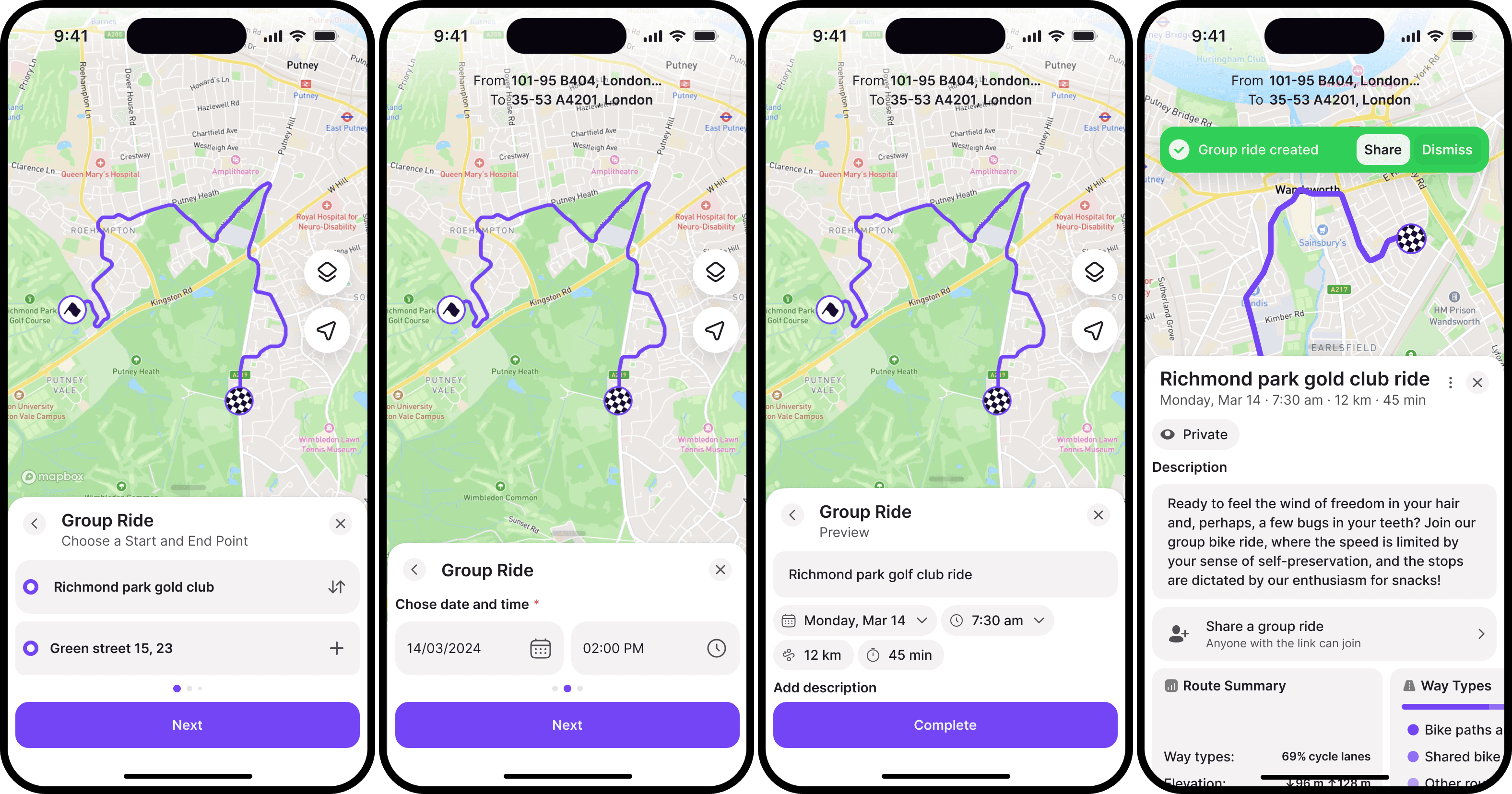
[fig 5]
Parts of standalone group ride creation flow done by Alexei Kholmatov
Our long-term goal for Group Rides was to merge solo and group experiences into one seamless flow — where any ride could become a shared one, even mid-route. But before scaling, we needed to validate the concept with a focused MVP.
Around that time, we partnered with Dom Whiting, the British DJ behind massive “bike raves” that draw up to 8,000 riders. One of his London events became the perfect real-world test case: participants would register through Veelzy, access all ride details, and navigate the route together through the app.
With so many users expected, we took a deliberate approach — prioritizing stability over scope and leaving room for extended testing. The goal: build small, build solid, and ensure we could support not just small groups, but entire moving crowds.
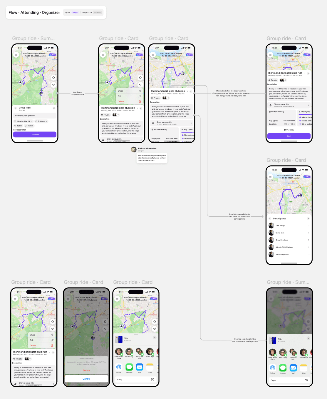
[fig 6]
Attending flow for user, that created group ride
dom whiting event
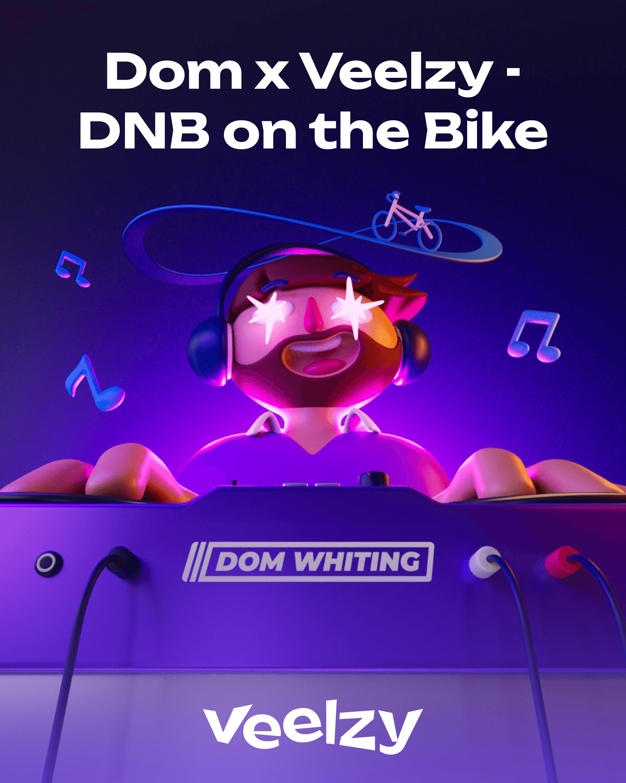
As mentioned earlier, to boost the launch of Group Rides, we signed a sponsorship deal with Dom Whiting to power his bike rave in London on March 23rd — giving us a three-month runway to build momentum.
Rather than relying solely on traditional marketing, we focused on amplifying the event itself. We partnered with other apps and local businesses along the route — bike rental companies like Forest and venues like BrewDog — creating a richer experience for riders. These collaborations weren’t just about visibility: they gave our partners real value by connecting their brands to a high-energy, community-driven movement.
[fig 7]
Great ad 3D done by Madina Bugdaeva
[fig 8]
One of the many ads we used during campaign
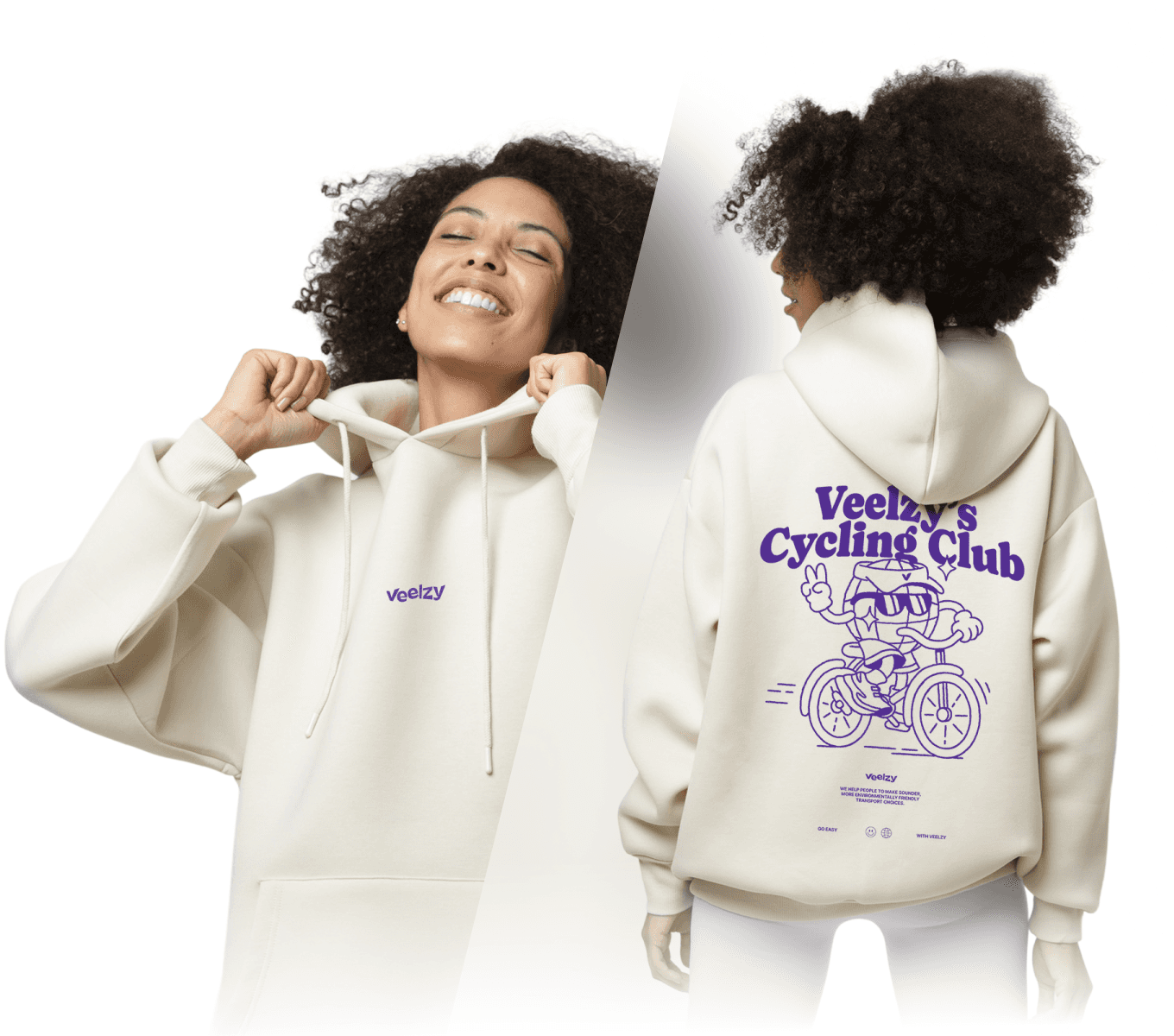
To deepen our presence around the event, we created a line of merch — gear that riders could wear, share, and connect with. It wasn’t just about visibility, it was about giving something back to the community.
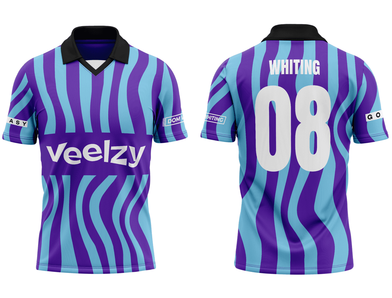
We also designed a custom Veelzy jersey for Dom himself, knowing it would become part of his performance — and part of the memory for thousands of riders that day.
[fig 9]
Merch hoodie
[fig 10]
Jersey for Dom done again by brilliant Madina Bugdaeva
Of course, as it often happens, life had its own plans. The London print shop we initially partnered with for Dom’s custom jersey wasn’t able to deliver on time, leaving us scrambling for a solution with just weeks to go.
Most sportswear printers turned us away — the timelines were simply too tight. I ended up speaking with over 40 facilities across London and nearby cities, trying to find anyone who could help. Eventually, the unexpected answer came from Moscow: a workshop there could produce everything within eight days, compared to the month-long lead times we were facing elsewhere.
It was a risk. Shipping from Moscow to London would take another seven days, cutting it close. We moved forward anyway — but in the end, DHL delays meant the jerseys arrived... the day after the event.
For a last-minute fix, we found a local workshop to create a basic backup jersey. It did the job, but it wasn’t what we had envisioned. Sometimes, even with the best planning, you just have to adapt and keep moving.
Despite the challenges, the event was a success. We launched and stress-tested the Group Rides feature in real-world conditions, attracted 5,000 new users, landed coverage in a BBC article and evening news, and helped organize one of the most memorable rides London had seen.
It wasn’t just a marketing moment — it was proof that Veelzy could bring people together at scale, and a major step toward building a true community in motion.
[fig 11]
Dom's video of the event